Background
I was the primary UX designer on this project and collaborated closely with a coworker, Ashley Jarvis. I performed the majority of the user research, and Ashley ran and analyzed a few tests as well. We worked together to analyze existing icons and design potential new icons for this project.
This project was part of a larger design update to the entire product this component was a part of.
Purpose
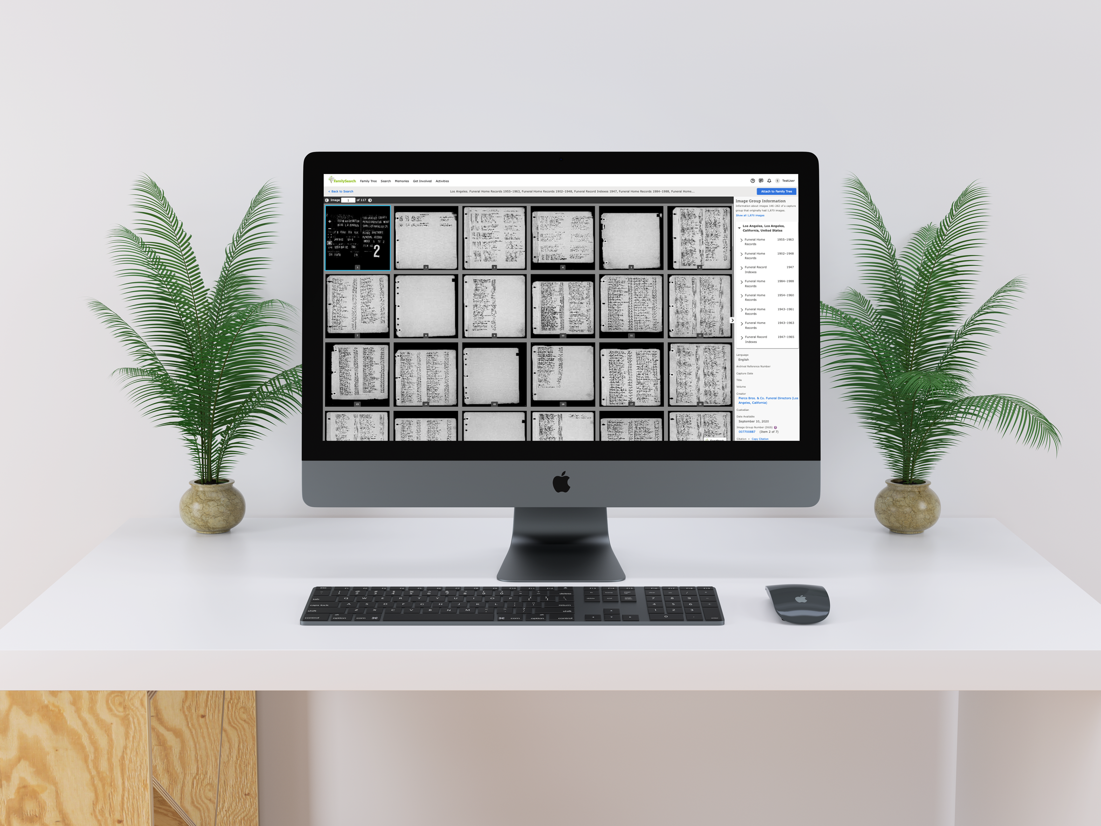
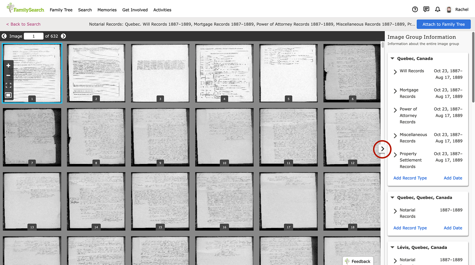
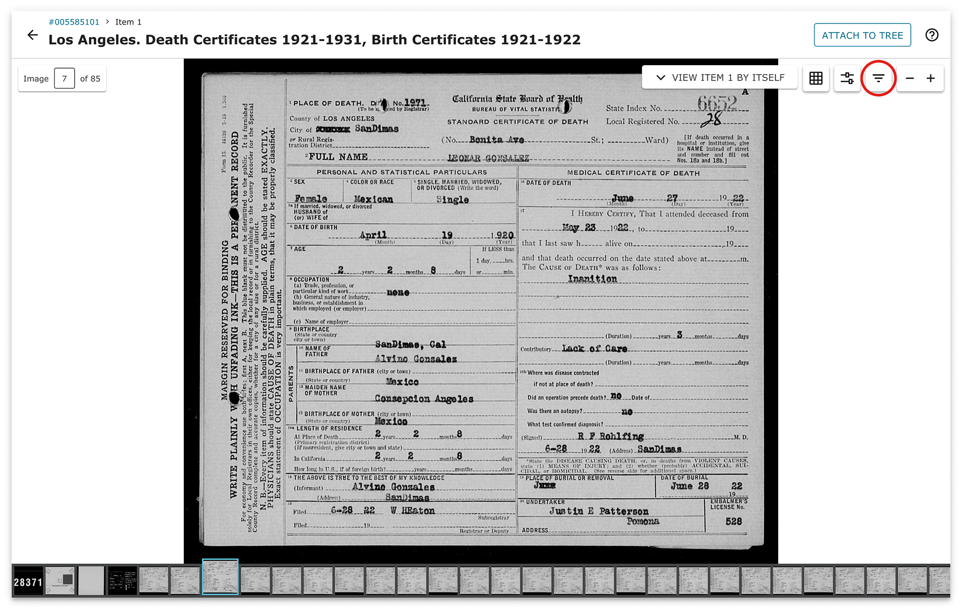
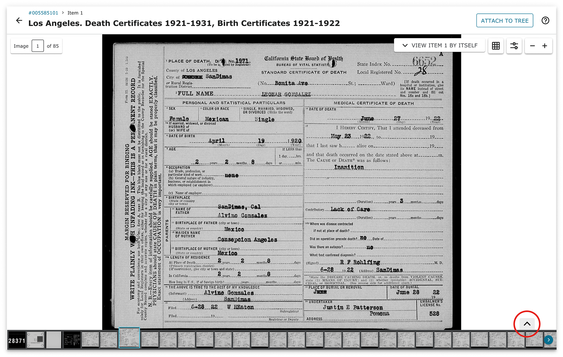
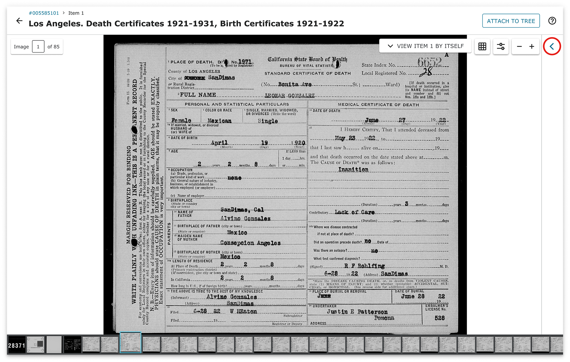
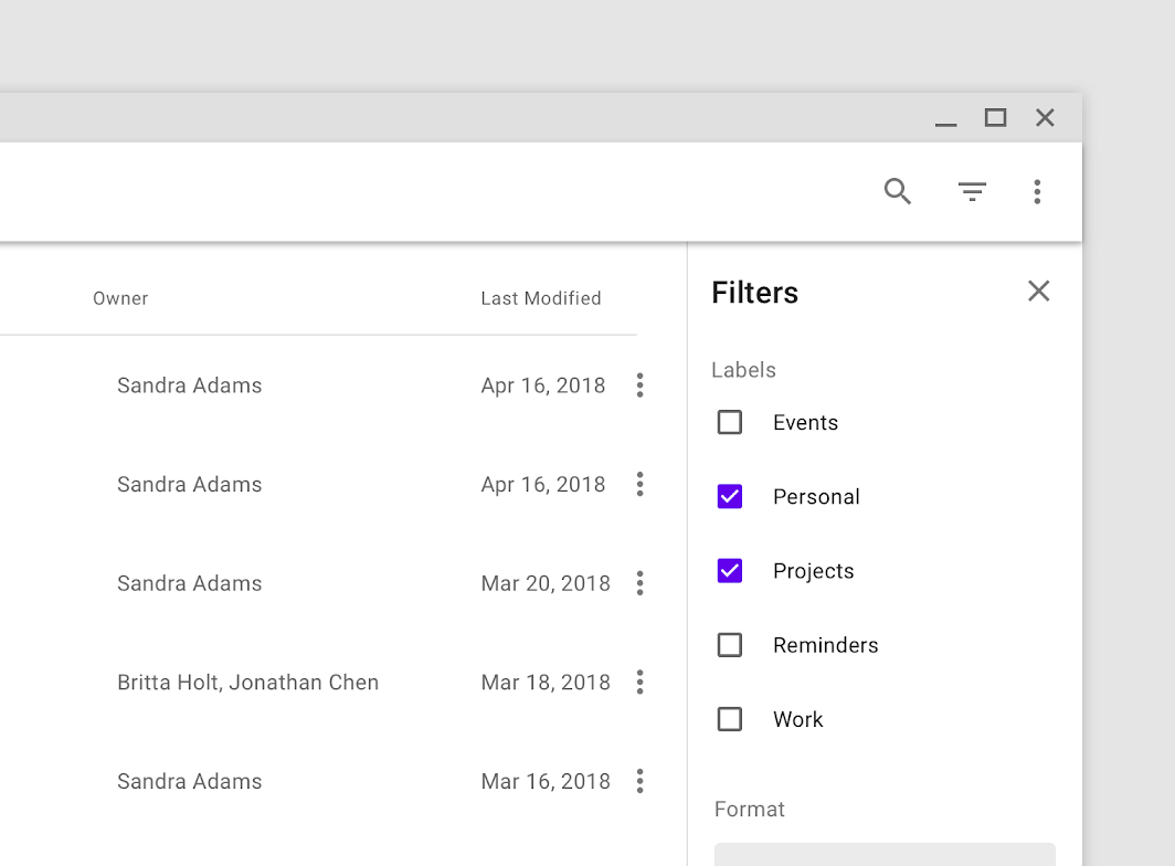
FamilySearch offers nearly 5 billion images from across the world. Explore Images is a product that houses and provides access to these images. After performing a search, users can browse through groups of images to view metadata and indexed data (when available) within the image viewer. The purpose of this project was to determine how to open and close the sheet holding metadata and indexed data.
This project was part of a larger design update to the entire product.
Constraints
This project required me to work within the following constraints:
• Adhere to Material Design conventions.
• Use existing design system components as much as possible.
• Support functionality to dock the information panel to the bottom or side of the screen.
Problem
In the past, chevron arrows were the standard for opening and closing sheets. In fact, our previous version of the image viewer product used chevrons. However, the chevron worked well when the sheet was only attached to either one side or the bottom of the screen. The updated product would include a single sheet that could be attached to the side or the bottom. This meant that we needed to find a solution that worked well independently of the sheet's location.
Starting Point
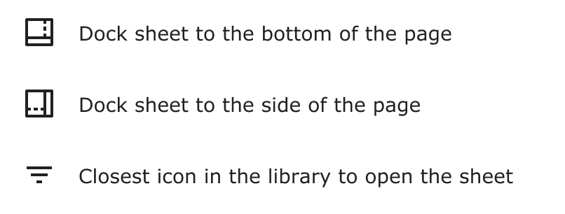
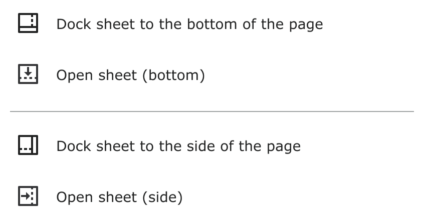
To start, we were given two icons: one to switch the location of the sheet from the side to the bottom and one to switch from the bottom to the side.
Additionally, Ashley had investigated existing icons in our design system and found the filter icon to be the closest replacement to open the image information sheet, though this icon was not performing well in testing.
Design & Testing
Ashley and I began by looking for an icon that could replace the filter icon. We found two arrow icons that to indicate if the sheet would open to the bottom or the side.
Surprisingly, the test results weren't nearly as positive as we had anticipated. Only 1 user (14%) went right to the icon, and 4 users (57%) really struggled to find the icon.
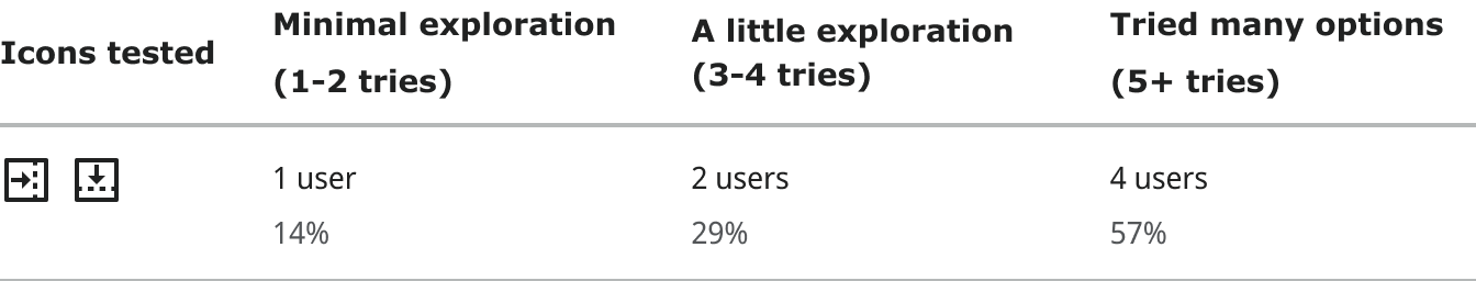
Additionally, as we tested the icons, we discovered a few critical issues with the arrow icon.
First, in our user test questions, we initially focused on asking the users to open the image data sheet. However, we noticed a few users confuse this icon with the icon to dock the sheet to the bottom or to the side of the page. We alternated questions about opening and closing the sheet with questions about docking the sheet to test how often this occurred. Once the questions were juxtaposed, we saw an increase in confusion between the two icons.
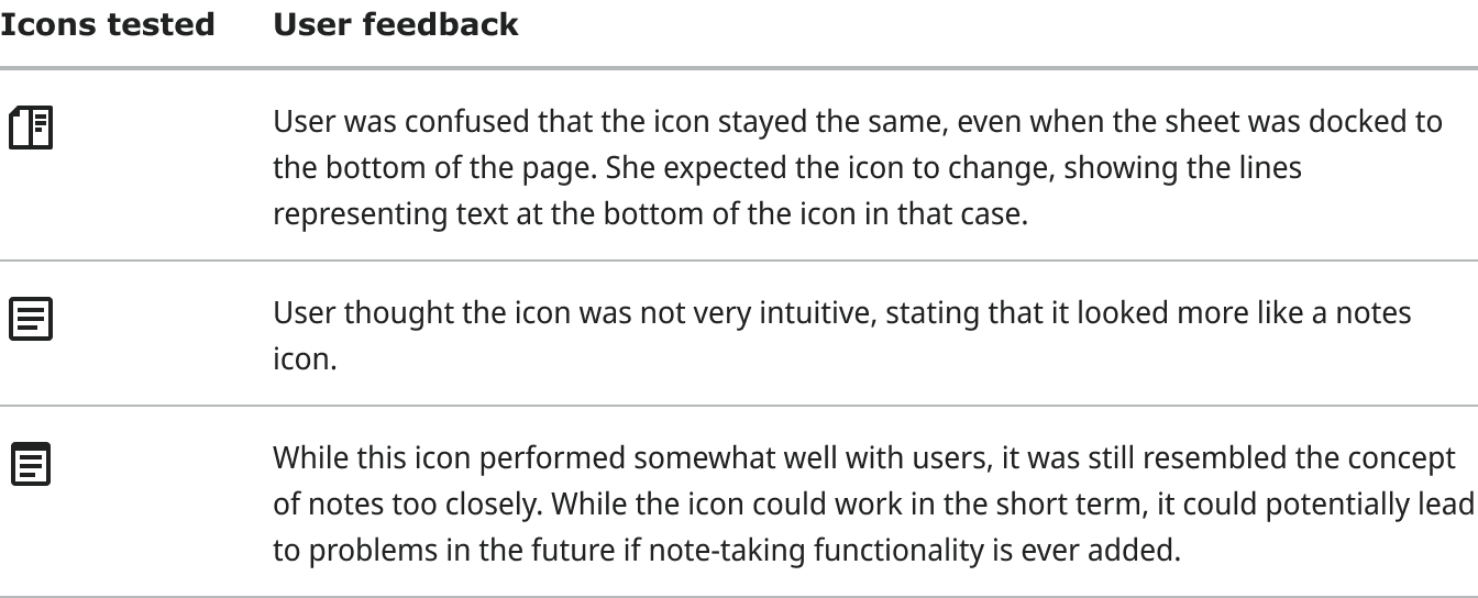
Second, we anticipated changing the icon shown depending on where the sheet was docked. This means that we would show one icon when the sheet was docked to the side and a rotated version of the icon with the sheet was docked to the bottom. However, not only was this not supported by our component library, but it also did not seem to fit well with Material standards or match the look-and-feel of the rest of the product.
These concerns were critical enough that we no longer pursued this icon as a possible option.
We continued iterating, testing three more sets of icons, but none of those performed very well, either.
At this point, we switched to testing the icons on a different part of page where users either voiced or indicated with their mouse pointer that they would look there first. While we did some testing on placement, we later realized that a formal A/B test would have produced more reliable results. In the future, this is something I hope to focus more on.
We tried several iterations with new icons but quickly realized that each icon was confusing to users and moved on.
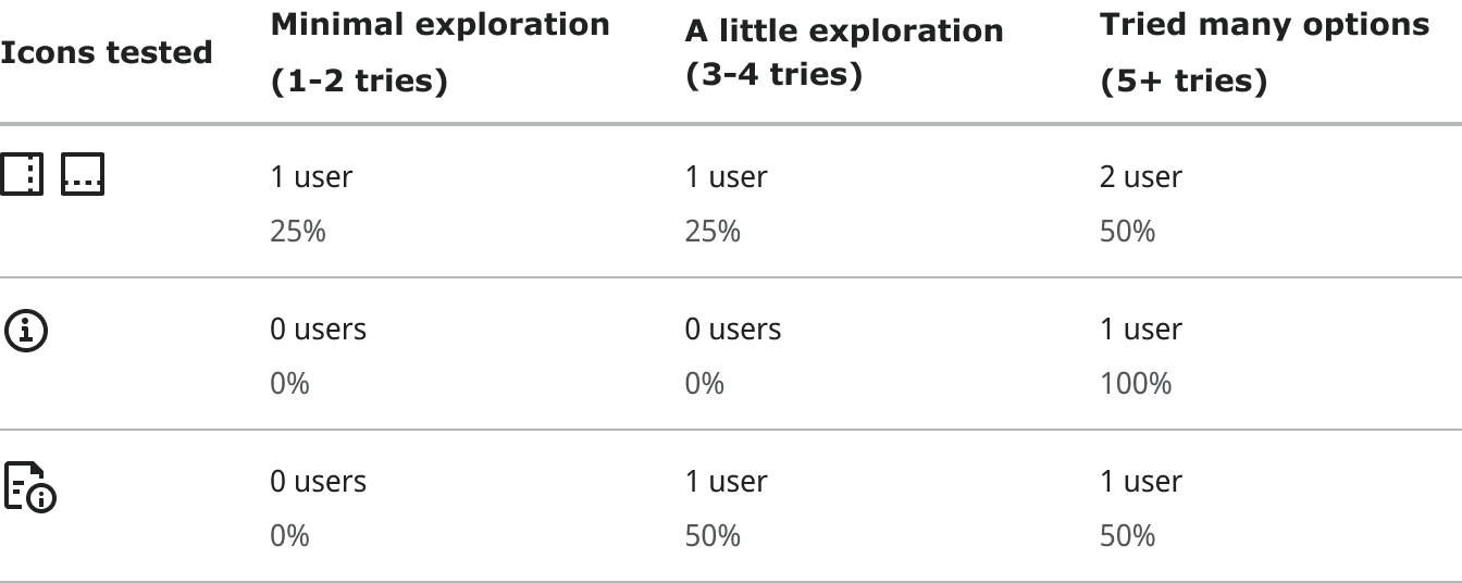
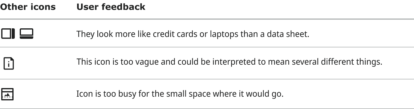
Throughout this process, we continued searching for icons in existing libraries and collections and even tried creating our own. Ultimately, none made enough sense to even begin testing them. There are dozens of icons that fall into this category, but here are an example of a few and why they did not work.
With little success at this point, we took a step back and looked at the design problem broadly. We determined that we needed an icon that could indicate that the sheet contained image data without indicating where the sheet would open. This would allow us avoid toggling the icon while still accurately describing the situation.
Inspired by this new perspective, I designed a new icon that met this criteria. Initially, this icon appeared very promising, with nearly 100% of users quickly finding the icon.

However, we continued running tests, and we noticed users were not sure what the icon did. While the icon was often what they clicked on first, it seemed more like it was by process of elimination rather than understanding.
At this point, we had canvassed several libraries and tried creating our own icon, but none of the options had performed well. We compared and contrasted the benefits and challenges associated with using each icon:
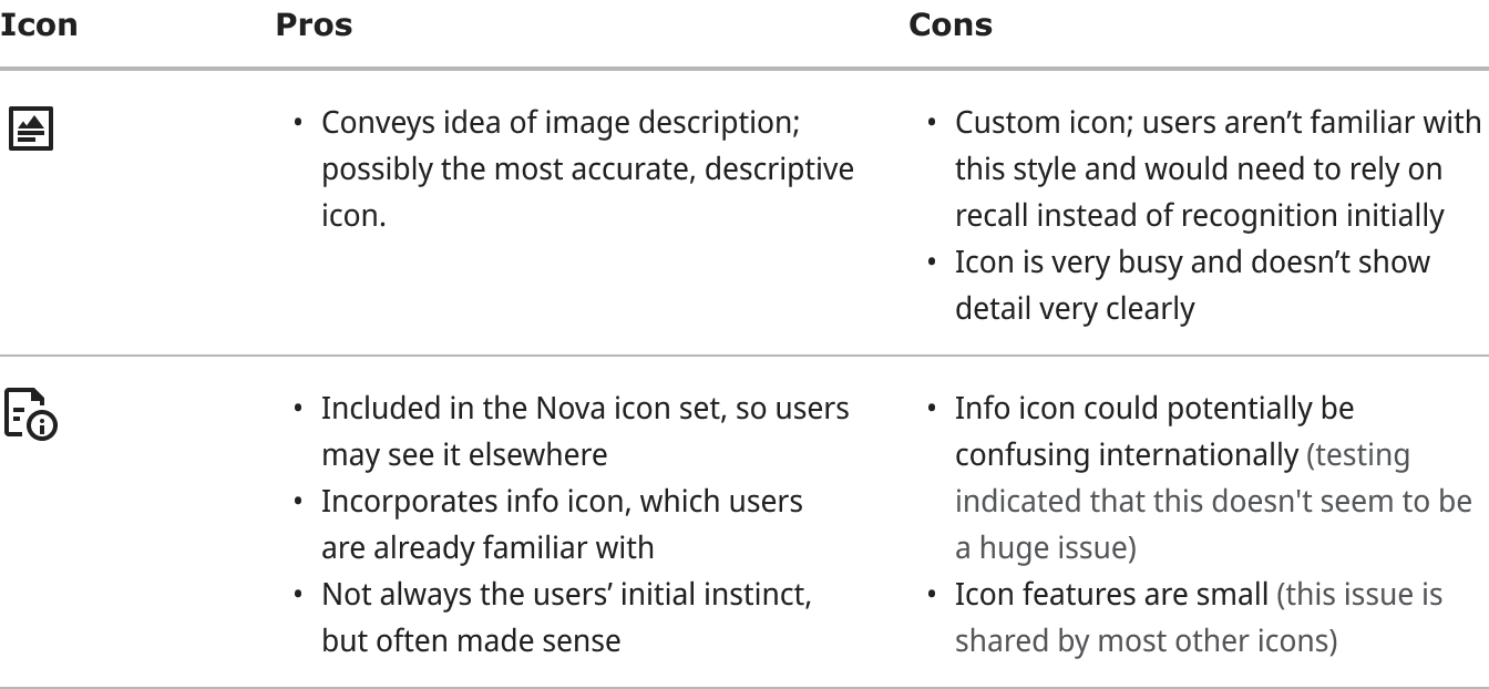
While using the second icon would have a greater cognitive load initially, we believe it will be the most understandable and sustainable over time.
We had eliminated the document information icon early on because we believed that the information portion of the icon used would be challenging internationally, particularly in cultures that do not use the Latin alphabet. However, after additional testing, international users generally didn't seem confused with the icon, perhaps because the information icon has been historically common in web design. Since this icon made the most sense logically and worked well internationally, we believed that this icon had the best chance of success.
Design Review
Ashley and I presented our findings in a design review with members of our team, our design managers, and the designers and developer over the design system. Before moving forward with the new icon, we were asked to explore two additional directions.
1. Research and try to apply the chevron convention in our designs.
2. Test out the performance of the hamburger menu icon to open the sheet.
Chevron Research
Ashley and I worked together to iterate through several ways we could open the data sheet using a chevron icon. While a few designs would have worked when the sheet was docked on the side, none of the designs worked well with the bottom sheet.
This option looked like the film viewer would expand upwards rather than the data sheet.
This design worked great when collapsed. However, when the data sheet is open, the arrow would conflict with the back button in the sheet.
We knew some sites used the chevron (most notably, Google Maps). However, fewer sites seemed to be using the chevron. Ashley researched similar products and looked at the recommendation within the Material standards. Many sites seemed to be using an icon to reopen their sheets.
This image is taken from the Material Design docs and shows the filtering sheet being opened with an icon in the header. See https://material.io/components/sheets-side#usage
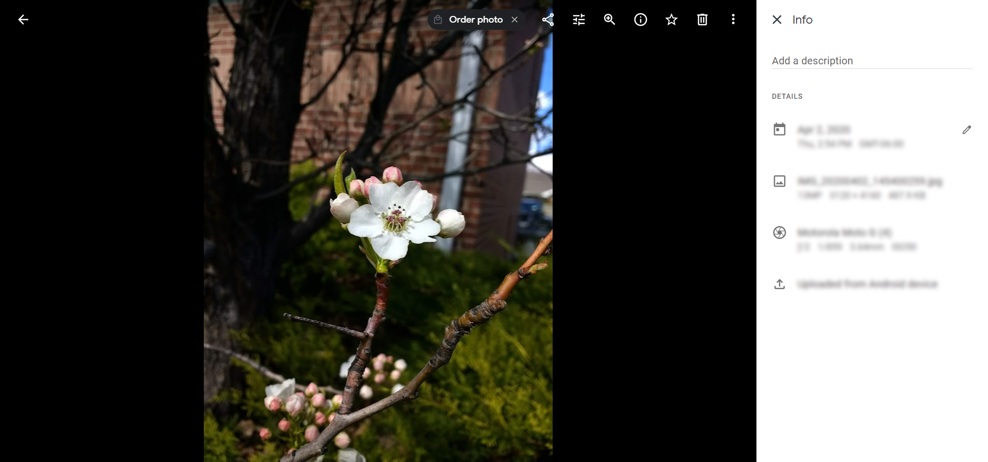
An example from Google Photos showing the info icon in the image controls opening a data sheet.
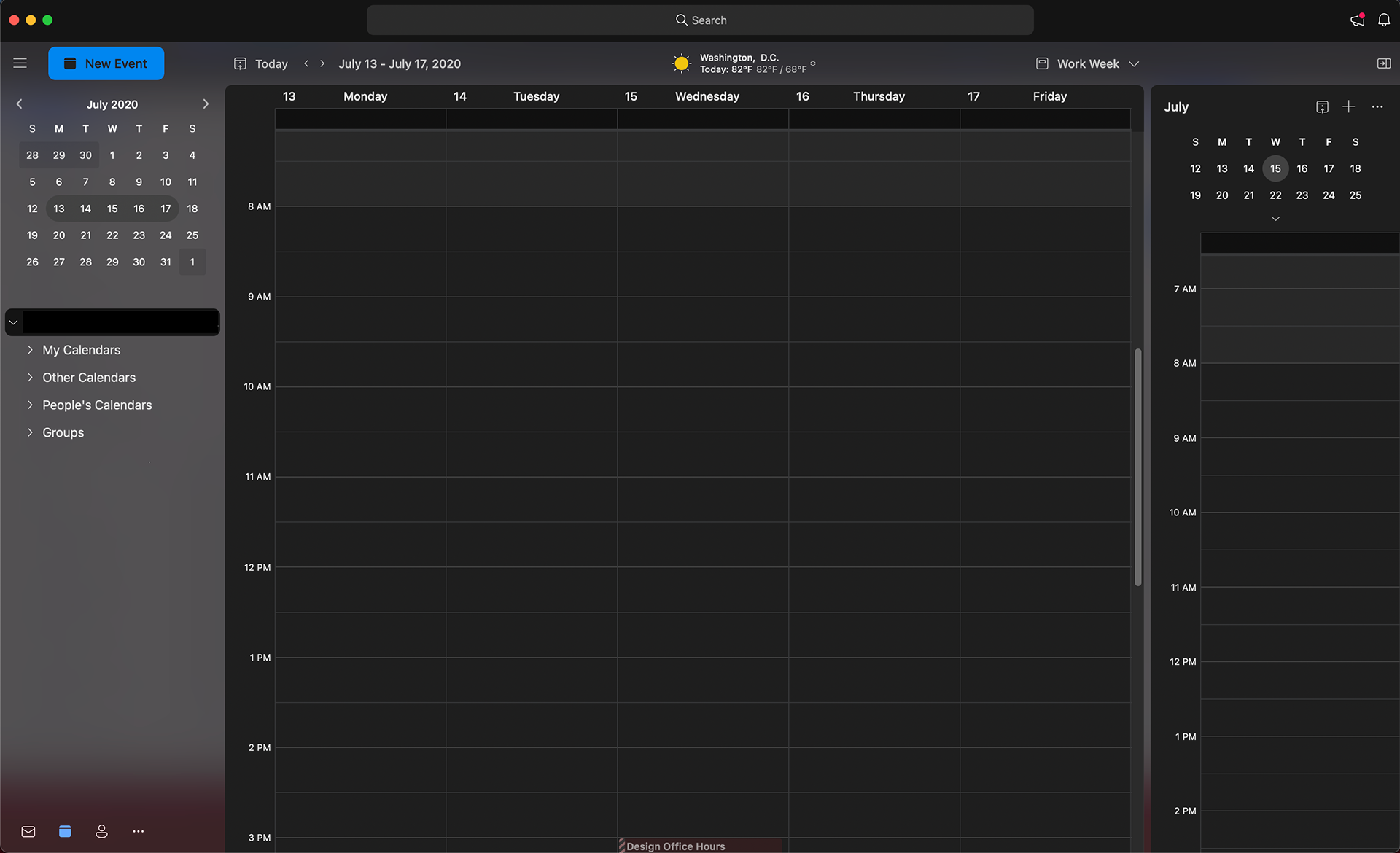
Microsoft Teams uses a an icon to show/hide the calendar on the right side of the screen.
Analyzing these experiences led us to three principles that generally seemed true in Material experiences:
• Sheets are generally open or closed rather than showing a partially hidden state.
• Unlike chevrons, the opening affordance no longer needs to be attached to the sheet.
• An icon describing the icon's purpose was more often used over arrows indicating the direction the sheet opened or closed.
While we weren't able to find a way to successfully create an iteration with a chevron icon, we felt more confident that using an icon in the image controls was the best direction and the most aligned with Material standards.
Hamburger Icon Research
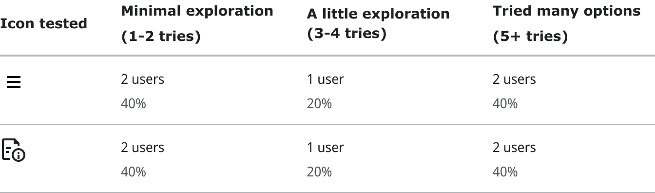
We also explored using the hamburger menu icon to open the sheet. The icon had the same success rate as the document-information icon.
Note that one user from each group either didn't respond to the question or was biased earlier in the test.
In addition, there are certain cases when the hamburger icon could appear twice on the page: once with site menu options and once to open the data sheet. This would likely be very confusing for users, so we believe that a different icon would promote greater understanding and discoverability.
Design Review Follow-Up
With our new research, we met for a second design review. While our research had led us back to our initial conclusion, the entire group felt much more confident that our proposal met Material standards and would fit well within the image viewer product. The new icon was unanimously approved.

Project Status
The icon is currently being added to the image viewer by the developers. When we release the product the image viewer is a part of, it will be a slow, limited release, so it may be several months before we learn how the icon is truly performing.
Lessons
This project taught me how to design when there isn't an ideal solution. Even after browsing through thousands of icons from different libraries and creating our own icons, we couldn't find an icon that was overwhelmingly successful. However, we tested our ideas with a total of 78 users, so we were able to feel confident that we were pursuing the solution that worked best for our users.